Refreshed branding and collaterals for Tuborg Myanmar.
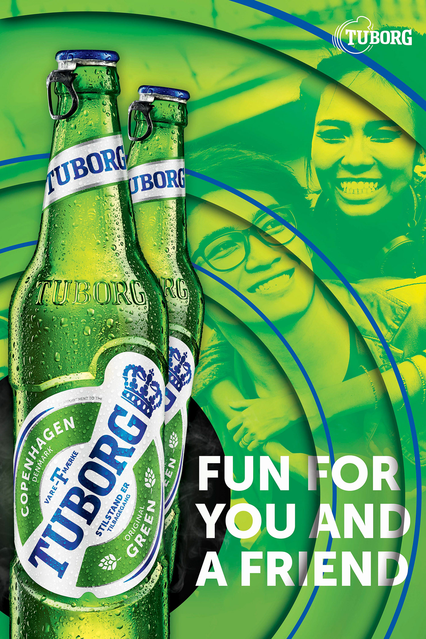
The design and artworks were to reflect the brands new intentions to diversify its current rock ‘n’ roll persona and open up to a broader audience.
In an attempt to be more distinguished, the global rebrand introduced blue as a secondary colour to contrast with Tuborg’s notorious green. The template also changed to a contemporary flat design style giving a fresh overall look. However, our team managed to convince global for some alterations to the designs for Myanmar because the contemporary flat design was slightly too progressive for the mass market. The adjustments were simple, add some depth in the beat-ring layers to give every artwork some sense of motions and the freedom for designers to utilise independent layer rings to tell stories.
.